| Reporting countries | 227 |
| Time span | 2017-01 → 2025-12 (108 months) |
| Indicators | MG_CIF_USD, MG_FOB_USD, TBG_USD, XG_FOB_USD |
| Unit | USD millions (exports FOB, imports CIF) |
| Source | IMF International Merchandise Trade Statistics (IMTS 1.0.0) |
Trade as a Signal: Detecting Conflict-Driven Anomalies in IMF Merchandise Trade Data
trade
conflict
anomaly-detection
imf-imts
acled
python
Using rolling-average deviation and permutation testing to find where political violence and trade disruption coincide — and asking whether that overlap is more than chance.
NoteA note on how this was made
This analysis was built through conversation with Claude, working from my phone: I set the questions and the analytical direction, reviewed every chart, and pushed back when something looked wrong; Claude wrote and ran the code. The only manual step was downloading the source data files. I’ve cleaned up the narrative since, but the analysis is what emerged from that back-and-forth.
Motivation
When a country’s trade volumes shift suddenly, something happened. Maybe it’s a pandemic, a sanctions regime taking hold, a civil war disrupting supply chains, or a regime change reshuffling trading relationships. Trade data is publicly available, high-frequency, and covers nearly every country in the world — which makes it an interesting early-warning signal if you can separate noise from meaningful disruption.
The IMF’s International Merchandise Trade Statistics (IMTS) dataset gives us monthly goods exports and imports for 227 reporting countries, all the way back to 2017. The ACLED dataset gives us monthly counts of political violence events for 245 countries over the same period.
The question this post explores: can we detect anomalous months in trade data, apply the same detection to violence data, and test whether those anomalies co-occur more often than chance?
The workflow, start to finish: get oriented in the trade data and profile a few countries whose stories span the range of what it can contain; build and compare three different methods for flagging anomalous months, and understand where each succeeds and fails; apply the winning method to the conflict data, which comes from an entirely separate source; and finally test co-occurrence — country by country with binomial and permutation tests, then globally across all testable countries.
The short answer is: sometimes yes, but less often than you might hope, and mostly for the countries where you’d expect it.
The Data
IMF IMTS
The IMF makes its IMTS data available via an SDMX 3.0 API, but for this analysis I downloaded the full bulk flat file — 402,443 rows covering 227 reporting countries, 108 monthly periods (January 2017 through December 2025), and four trade indicators. Each row is a unique REPORTER.INDICATOR.PARTNER.FREQ combination.
The series code structure encodes everything we need. For instance, UKR.XG_FOB_USD.G001.M is Ukraine’s monthly goods exports (FOB, USD millions) to the world aggregate. G001 is the IMF’s code for the world total — filtering on this partner gives us each country’s total trade volume rather than any bilateral relationship.
ACLED Violence Data
The Armed Conflict Location & Event Data Project (ACLED) tracks political violence events globally. Their monthly country-level counts give us a measure of conflict intensity that we can align with the trade data. It covers 245 countries with data starting in 1997, though with much better coverage from 2017 onward — conveniently aligned with the IMTS window.
First Look: Global Trade Volume
Before looking at individual countries, it helps to see the aggregate. Summing all reporting countries’ exports to the world gives a useful baseline — the broad strokes of global trade over the period.
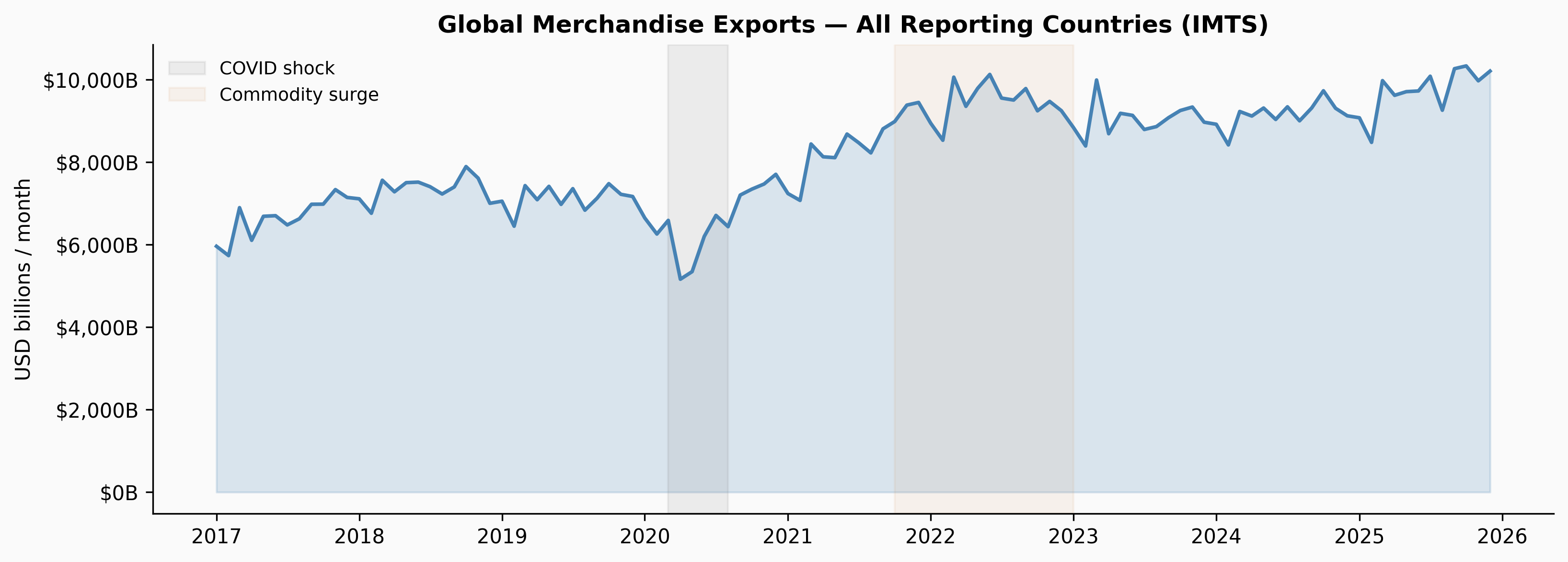
The COVID shock in early 2020 is the clearest feature — a sharp cliff followed by a rapid recovery. It’s a useful preview of what a global disruption looks like in this data; the rest of the post hunts for disruptions that hit one country at a time.
Country Deep-Dives
With the global picture established, we profile three countries chosen to span the range of what this data can contain: Ukraine — a sharp structural break, co-located with violence; Venezuela — a steady multi-year decline; and Yemen — chronic conflict where the disruption shows up as much in the data’s quality as in its values.
For each country, four panels tell the story: gross trade flows, trade balance, political violence events, and the share of trade with each country’s top 10 bilateral partners over time. (The anomaly-detection sections that follow still run on a broader six-country set that adds Yemen, Kenya, and Mexico.)
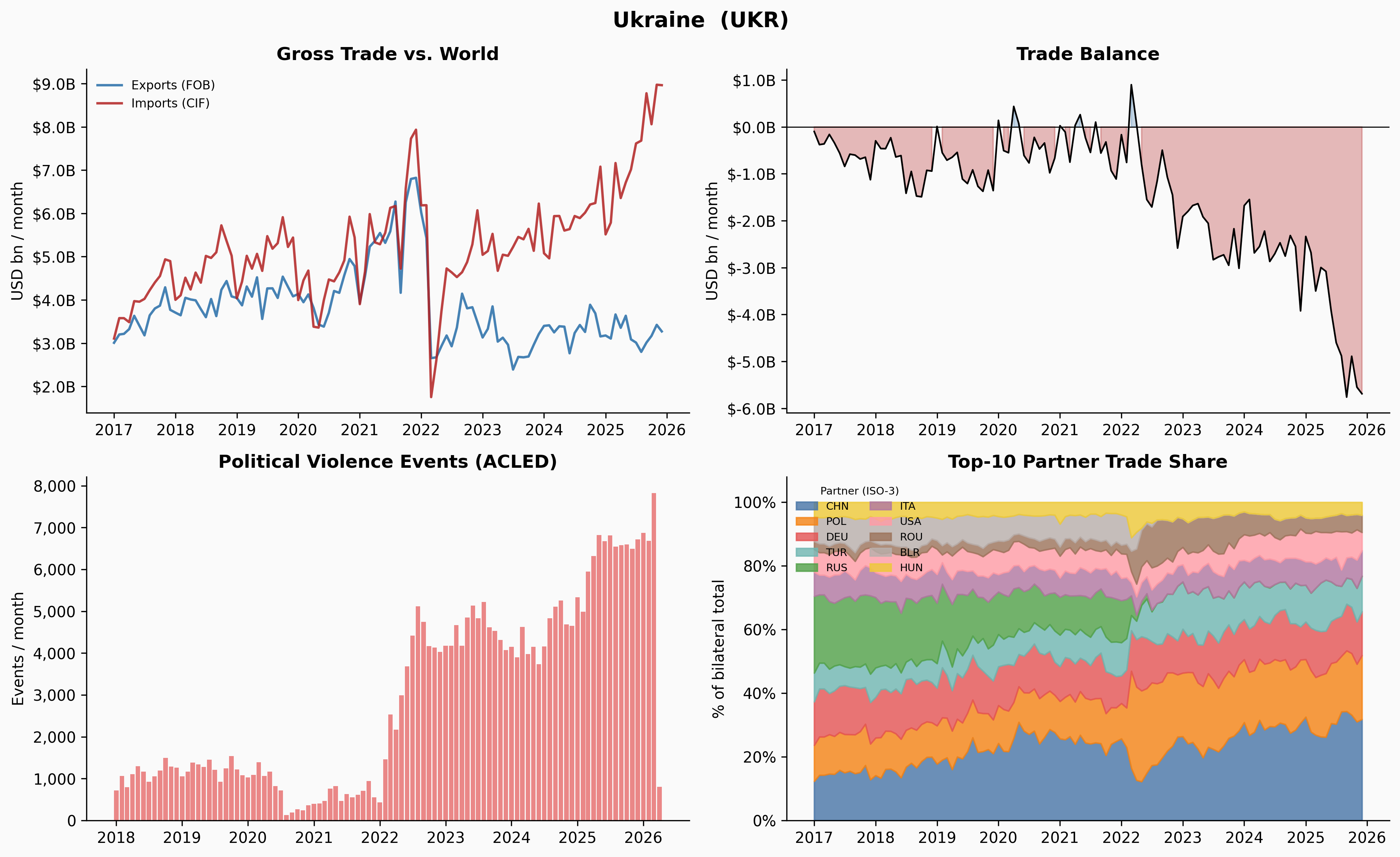
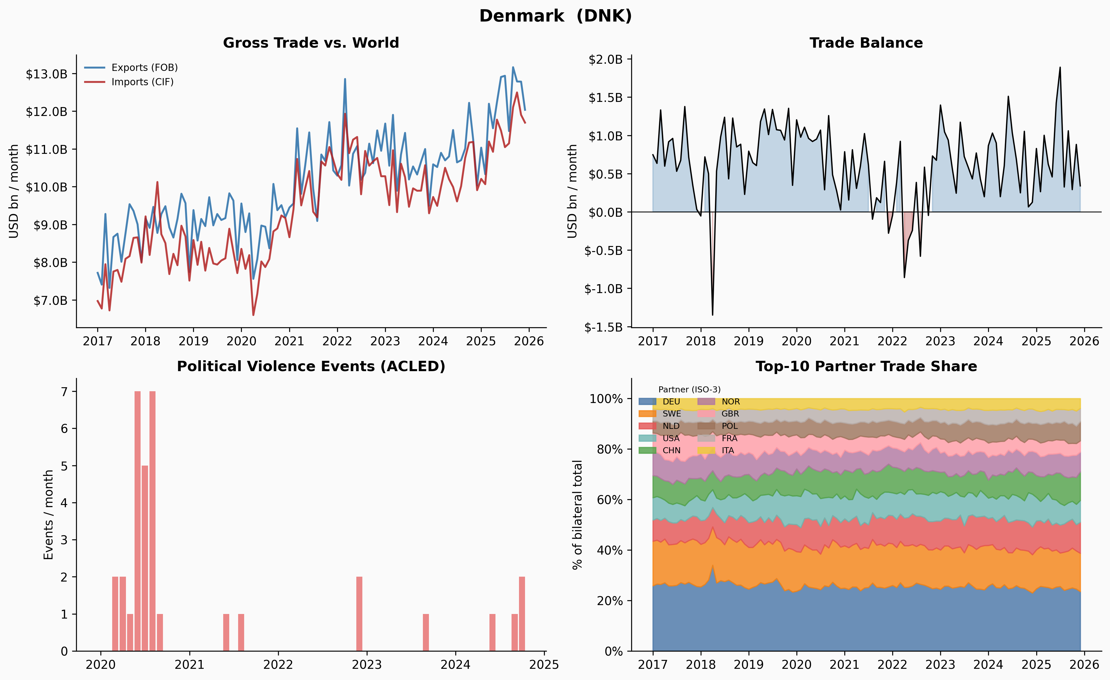
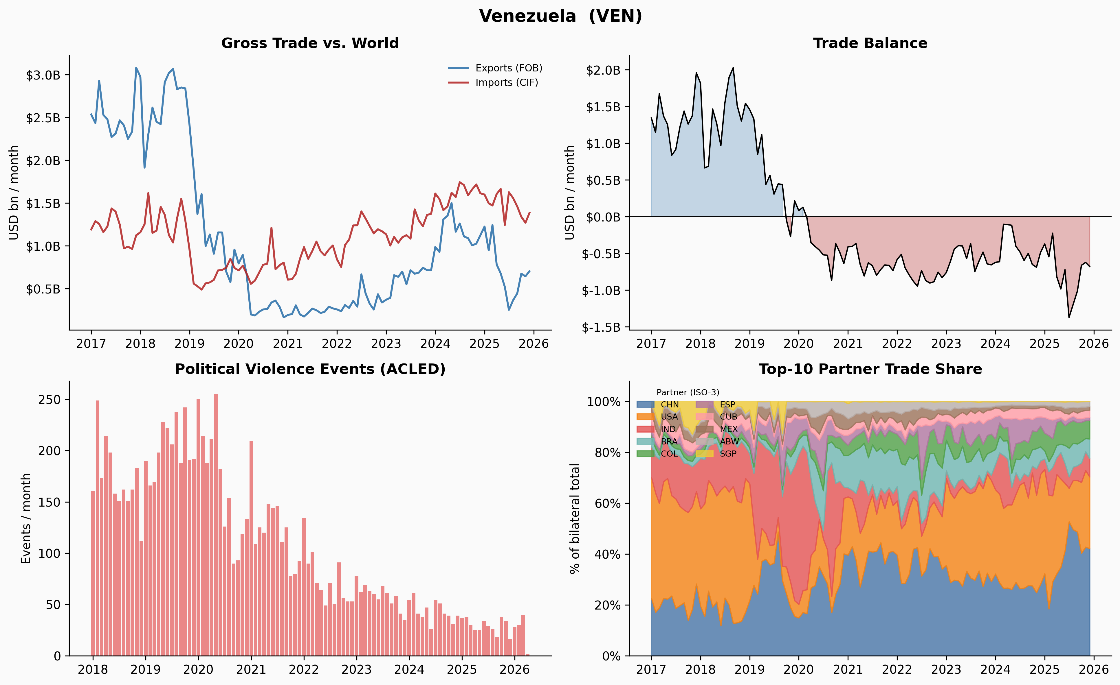
A few things jump out immediately. Ukraine’s trade collapses sharply in early 2022 — and the Russia share in Panel 4 drops to near-zero at exactly the same moment. Venezuela’s trade contracted steadily from 2018 through 2020, losing about 65% of its volume before stabilising — no single dramatic month, just a long slide. Yemen is a different animal entirely: small volumes, erratic partners, and gaps — a reminder that in an active conflict, the measurement system degrades along with the economy, and an anomaly detector has to cope with both.
Anomaly Detection
The Problem with Simple Month-over-Month Thresholds
The most obvious approach to flagging unusual months is to look at month-over-month percentage changes and flag anything in the tails. But this has a structural flaw: by definition, there will always be outliers. If you define anomalies as the top and bottom 5% of a single country’s MoM distribution, you’ll always find them — even if the country’s trade is perfectly stable.
This gave us three angles to try, with increasing sophistication:
Cross-country distribution: pool MoM changes across all 227 countries and flag anything in the global tails. This ensures the threshold is calibrated to what counts as extreme by world standards — a country would have to move more than 97% of all country-months to get flagged. The downside: volatile countries (Yemen, Venezuela) might dominate the tails regardless of whether anything unusual happened.
Within-country z-score: flag months where the MoM change is more than 2σ from that country’s own historical mean. This asks “is this unusual for this country?” but inherits the same problem — you’re guaranteed to find something if you wait long enough.
Rolling 12-month average deviation: compute a trailing 12-month average of trade volume, measure how far each month sits from that average, then flag the tails of that distribution. This turned out to be the most useful method, and it’s worth understanding why.
The Rolling Average Method
The key insight is that the rolling average lags. When Venezuela’s trade fell from $4.1B/month in late 2018 to $1.4B by late 2019 — a 65% collapse — no single month-over-month change was large enough to trigger a simple threshold. The biggest individual drops were around 27%, just inside a ±28% within-country threshold. But by mid-2019, the rolling average still reflected the healthier levels from 6–12 months prior, so the deviation between current trade and the rolling baseline had grown large enough to flag.
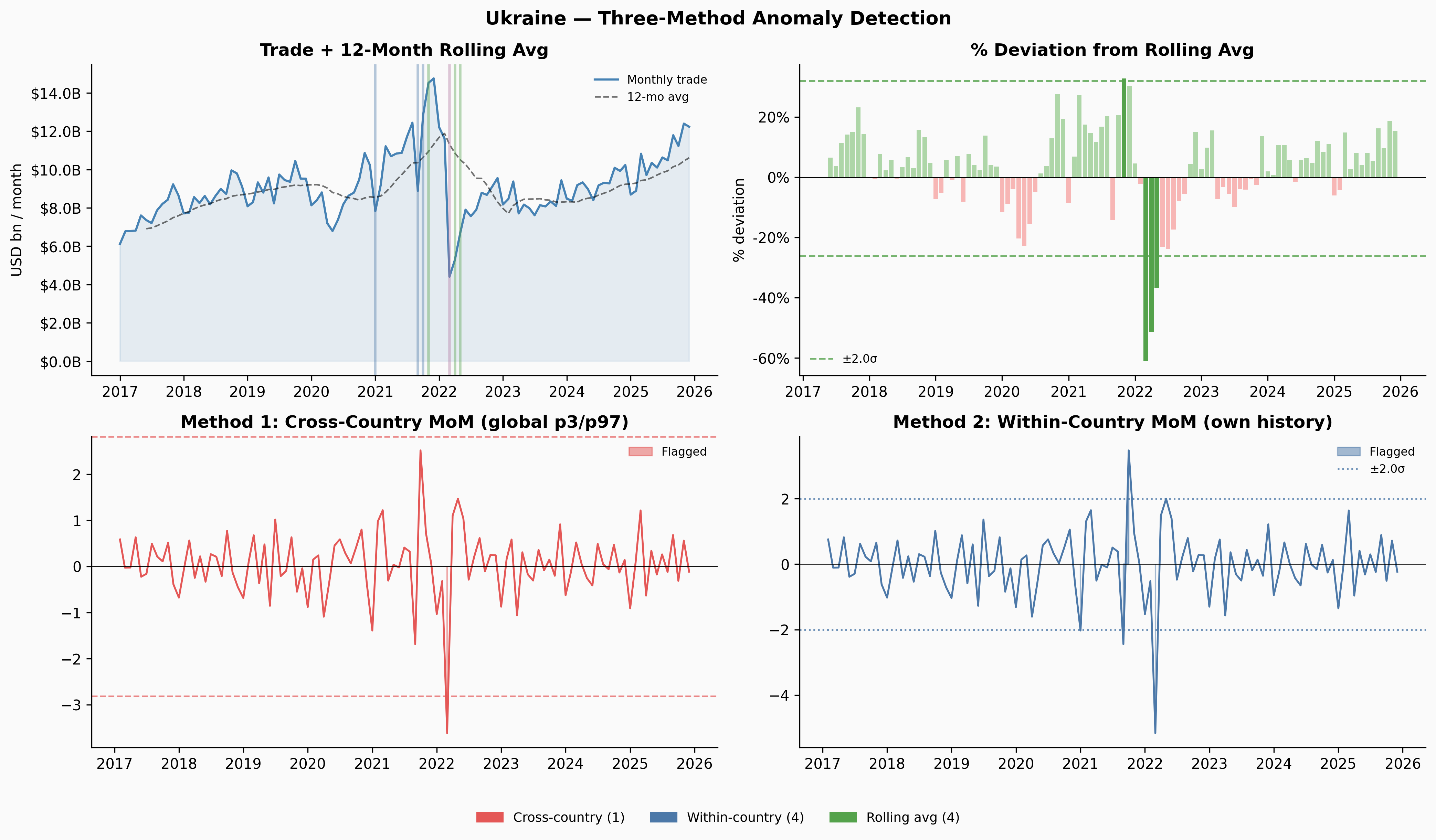
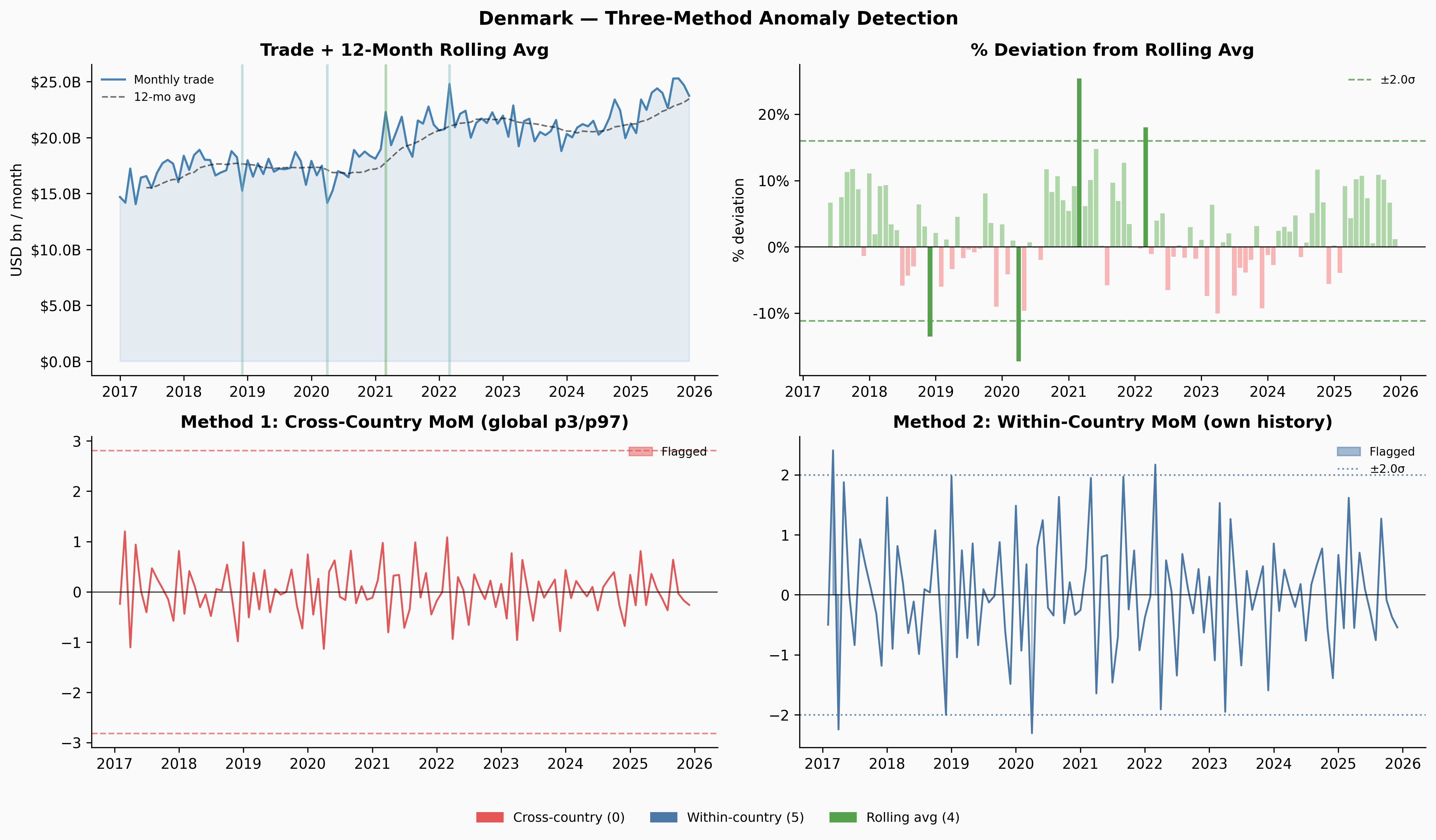
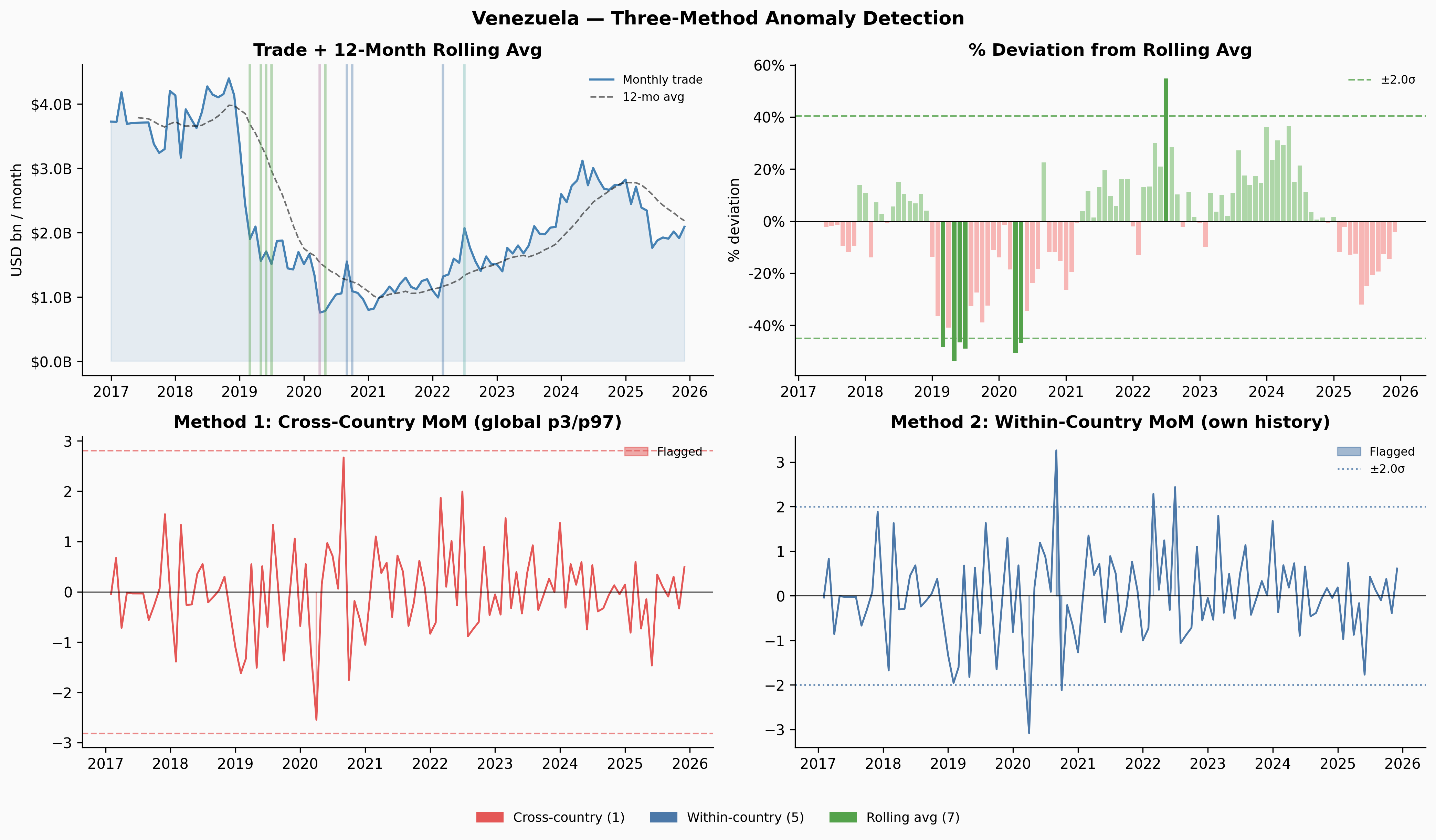
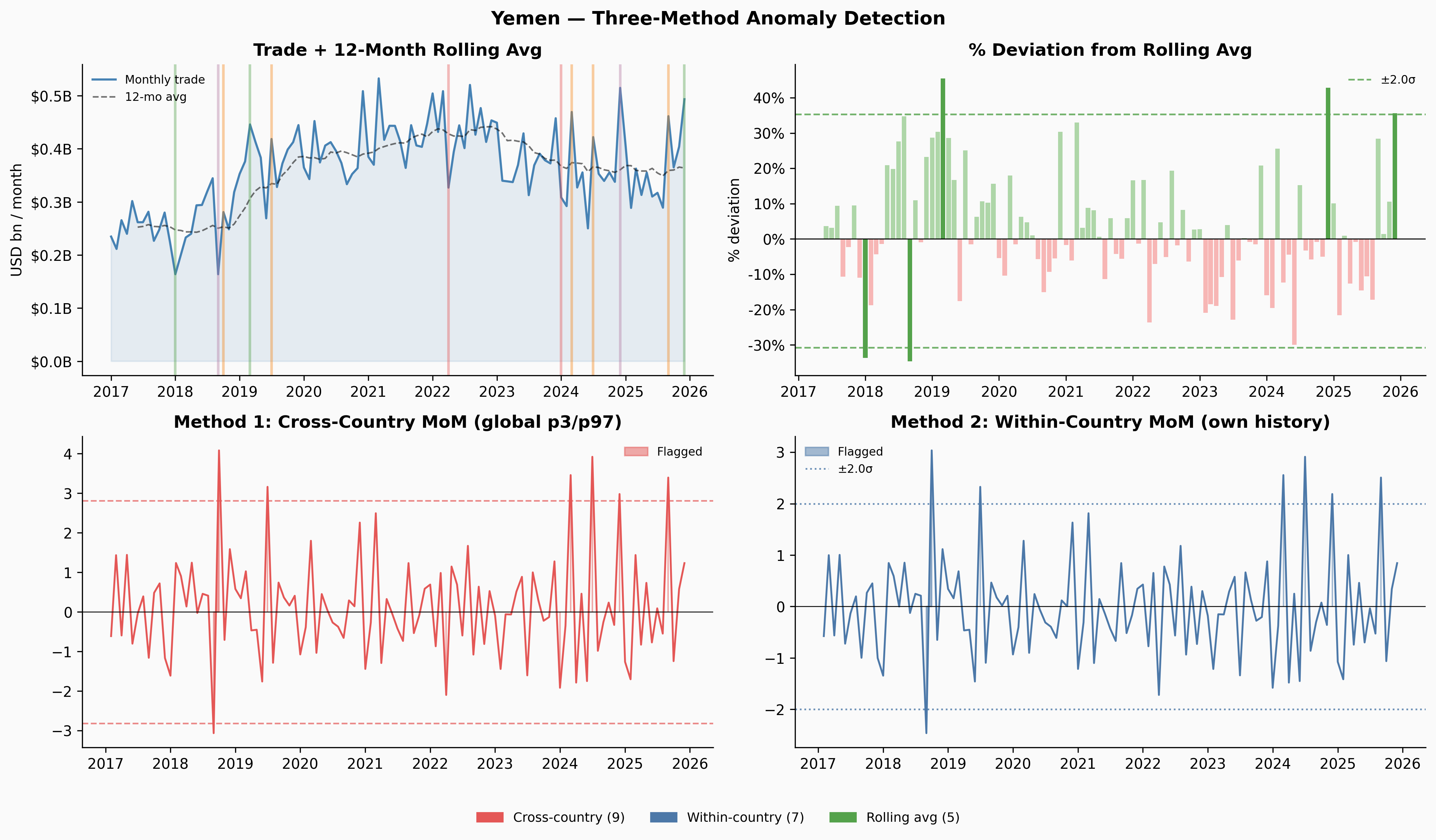
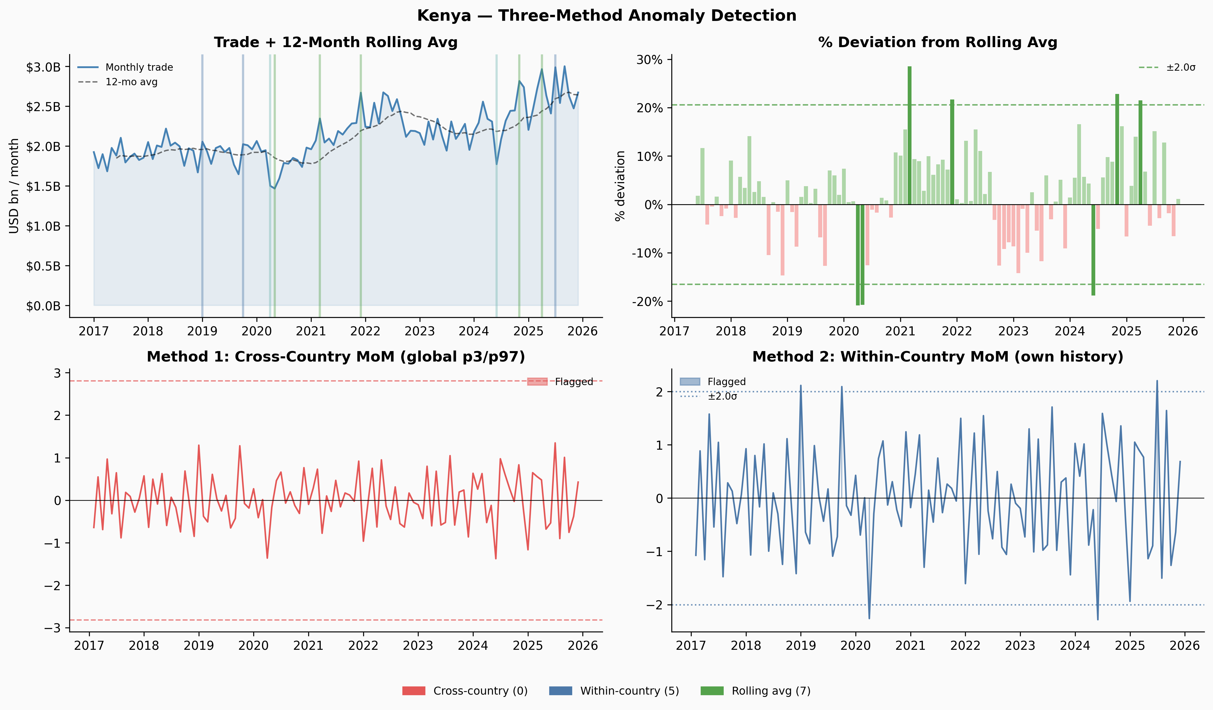
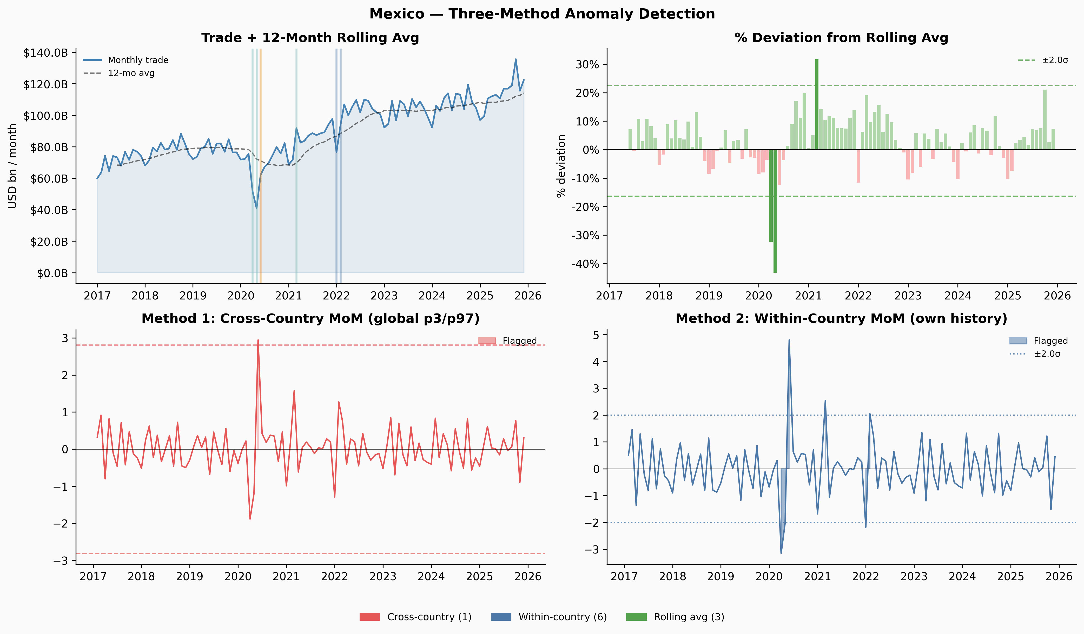
The three methods complement each other. Cross-country only fires when something is genuinely extreme by global standards — Denmark and Kenya never clear that bar at all. Within-country flags more, but those flags are meaningful: they’re saying “this is unusual for this country.” Rolling-average deviation caught Venezuela’s 2019 slow collapse that both MoM methods missed entirely.
Applying the Same Logic to Violence Data
The rolling-average deviation method transfers directly to the ACLED violence data. The same intuition applies: we’re not asking whether a country is violent in absolute terms, but whether its current violence level is unusual relative to its own recent baseline. We build a monthly violence series per country; the resulting anomaly flags appear alongside the trade flags in the per-country panels of the next section.
Co-occurrence: When Trade and Violence Anomalies Align
With both sets of anomaly flags in hand, we can ask a simple question: does a trade anomaly in a given country tend to occur near a violence anomaly?
We define “near” as within a 3-month window. This captures both the possibility that violence causes trade disruption (perhaps with a lag as sanctions are imposed or supply chains reroute) and the possibility that trade disruption precedes or accompanies escalation.
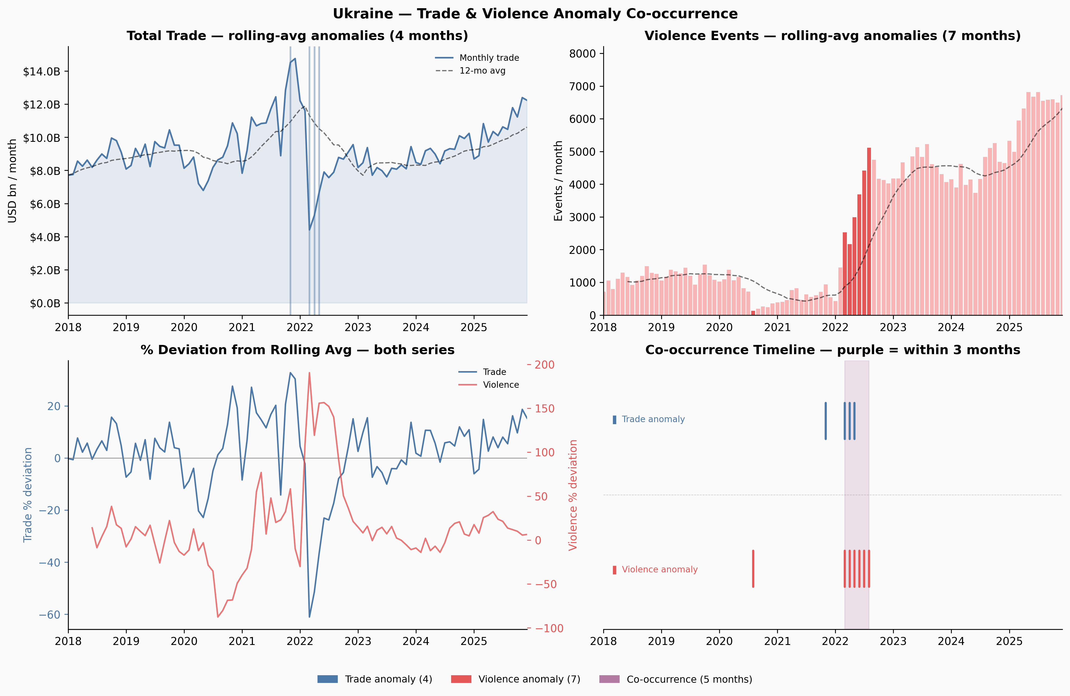
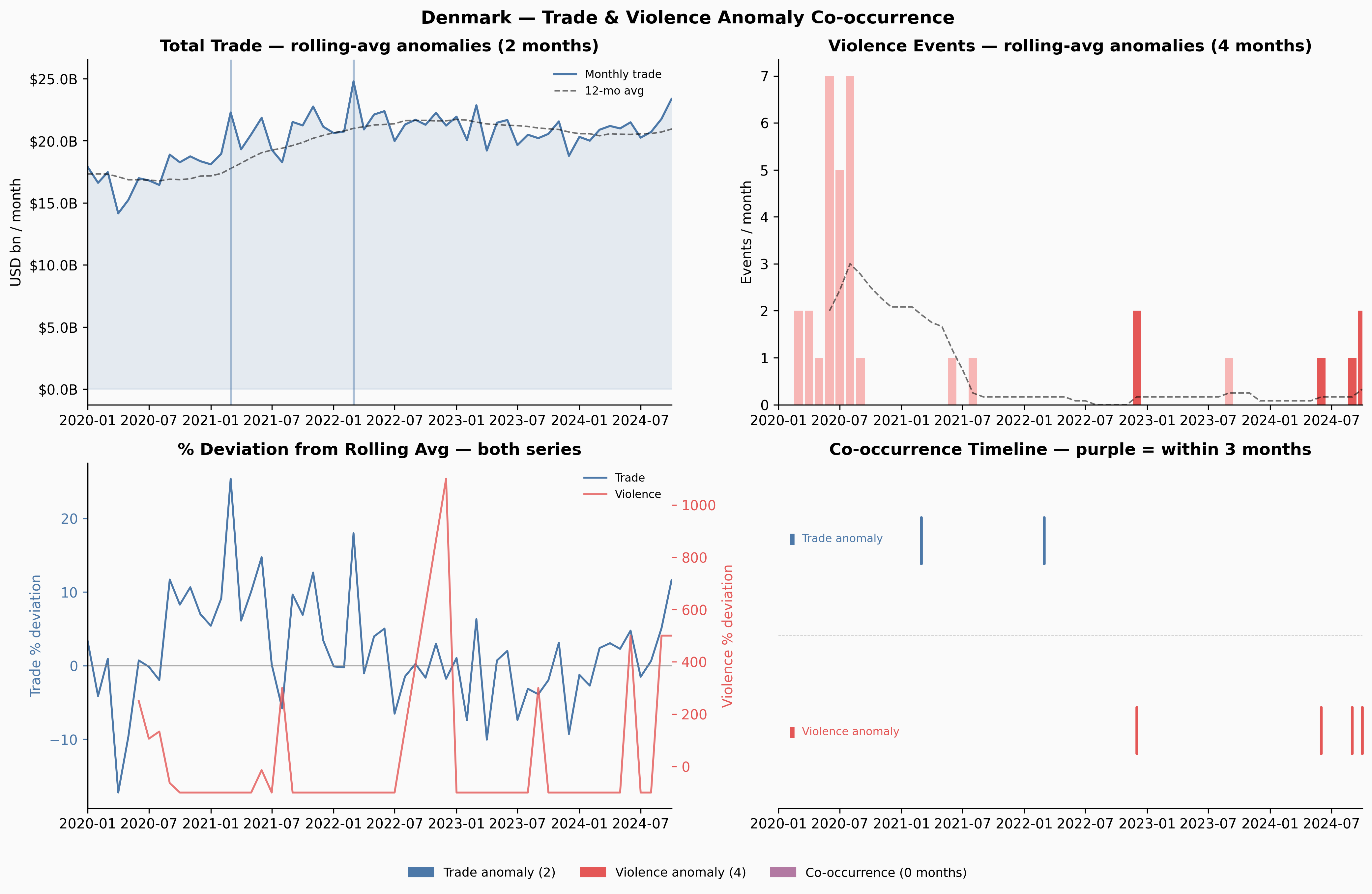
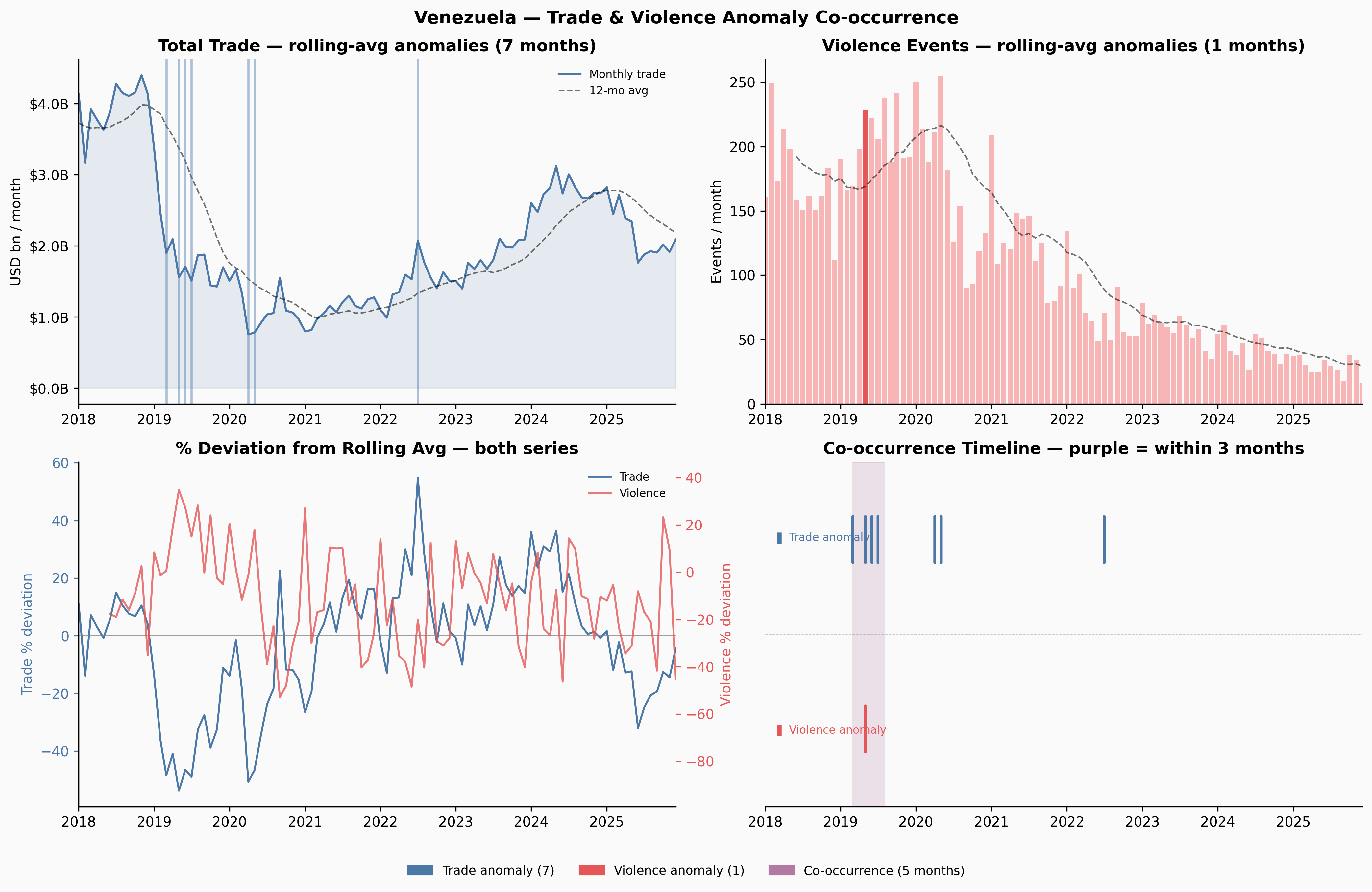
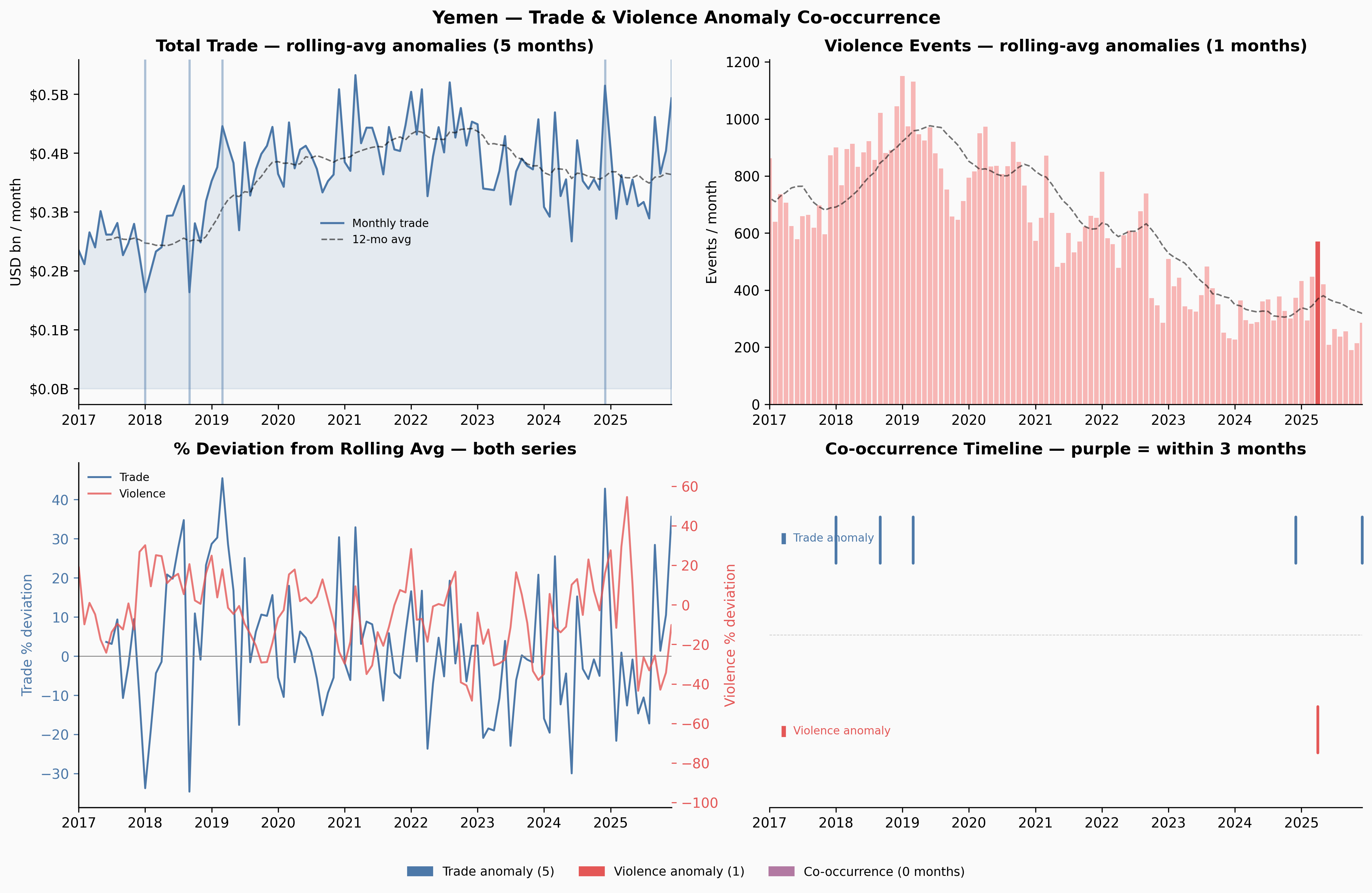
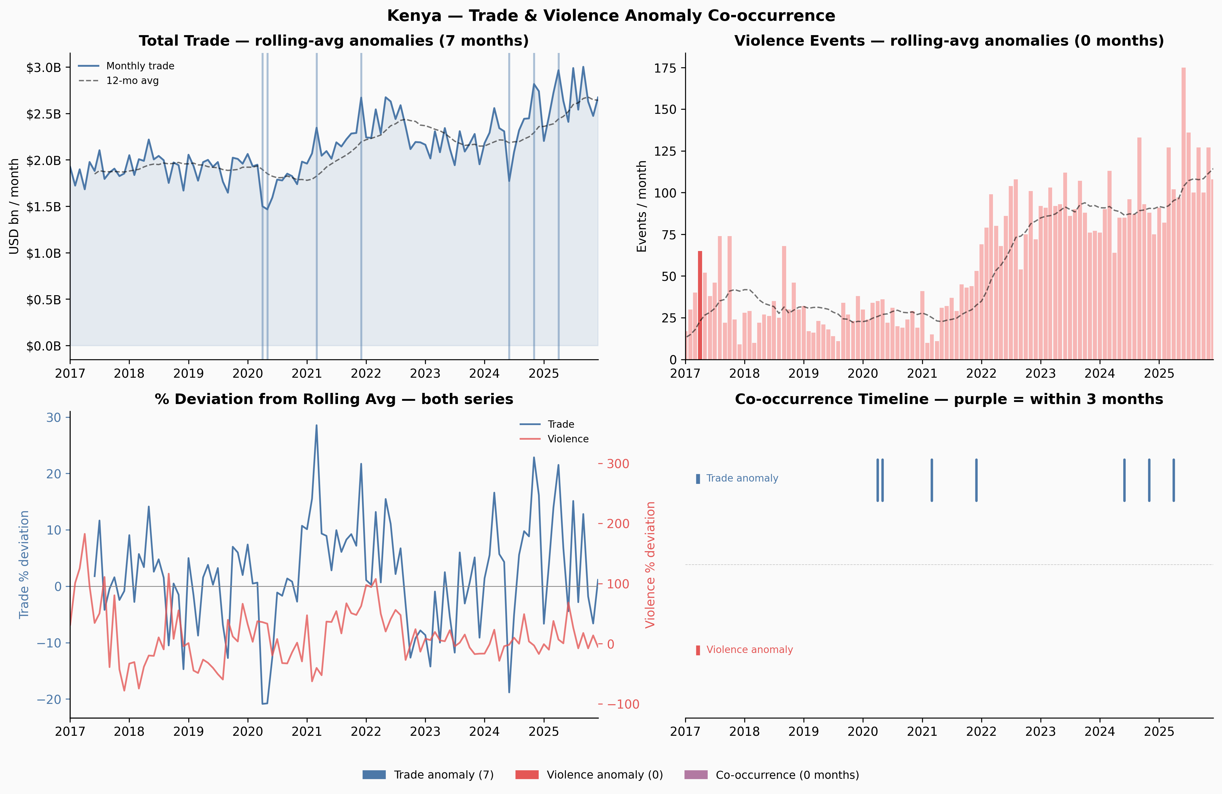
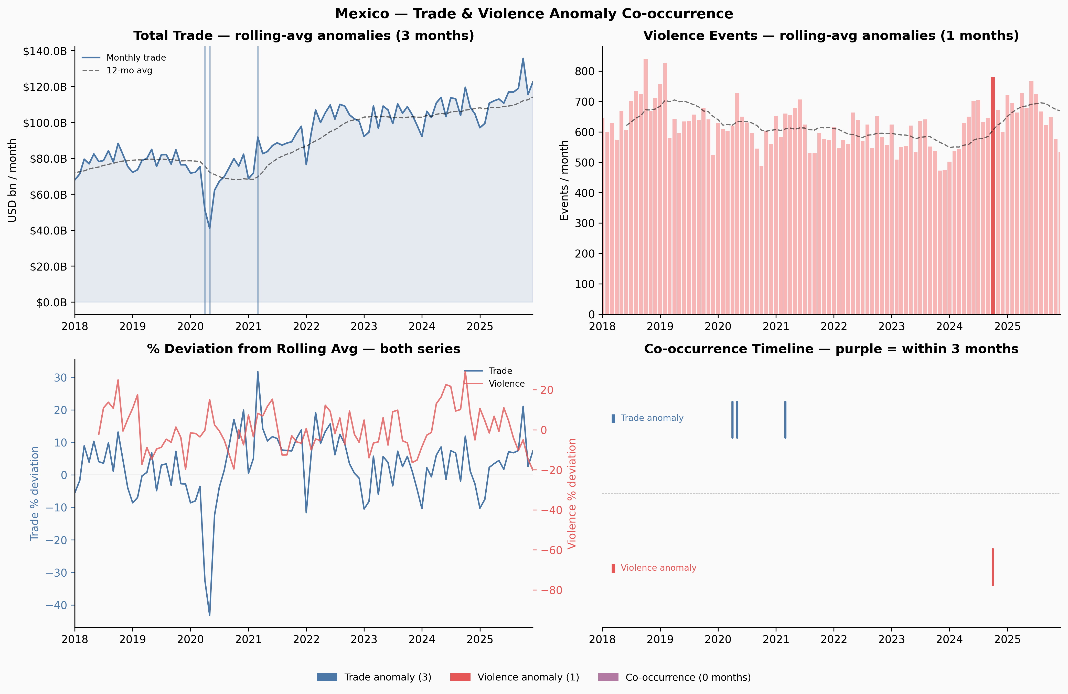
Ukraine and Venezuela show meaningful co-occurrence windows. Yemen — despite having more anomalies than any other country — shows none: the trade and violence disruptions appear to be temporally offset, which itself is interesting. Yemen’s trade may have adapted to the conflict reality over time in ways that decoupled the two series.
Significance Testing
Per-Country: Are the Co-occurrences More Than Chance?
The core question is: if trade anomalies and violence anomalies were completely independent, how often would they co-occur just by random alignment?
The framing is simple: if trade anomalies occur with probability p_t (the fraction of months flagged) and violence anomalies with probability p_v, then under independence, the probability of both occurring in the same month is simply p_t × p_v — exactly the probability of two independent coins both landing heads, where each coin is weighted by its respective anomaly rate.
We use two tests:
Binomial test (same-month): Given N months and an expected co-occurrence rate of p_t × p_v, what’s the probability of observing at least K same-month co-occurrences? This is a one-sided binomial test.
Permutation test (windowed): For the 3-month windowed definition, the expected count isn’t as clean to compute analytically. Instead, we randomly shuffle the violence anomaly flags 1,000 times (preserving the same number of flagged months) and see how often the shuffled data produces as many co-occurrence months as the real data. The p-value is the fraction of shuffles that match or beat the observed count.
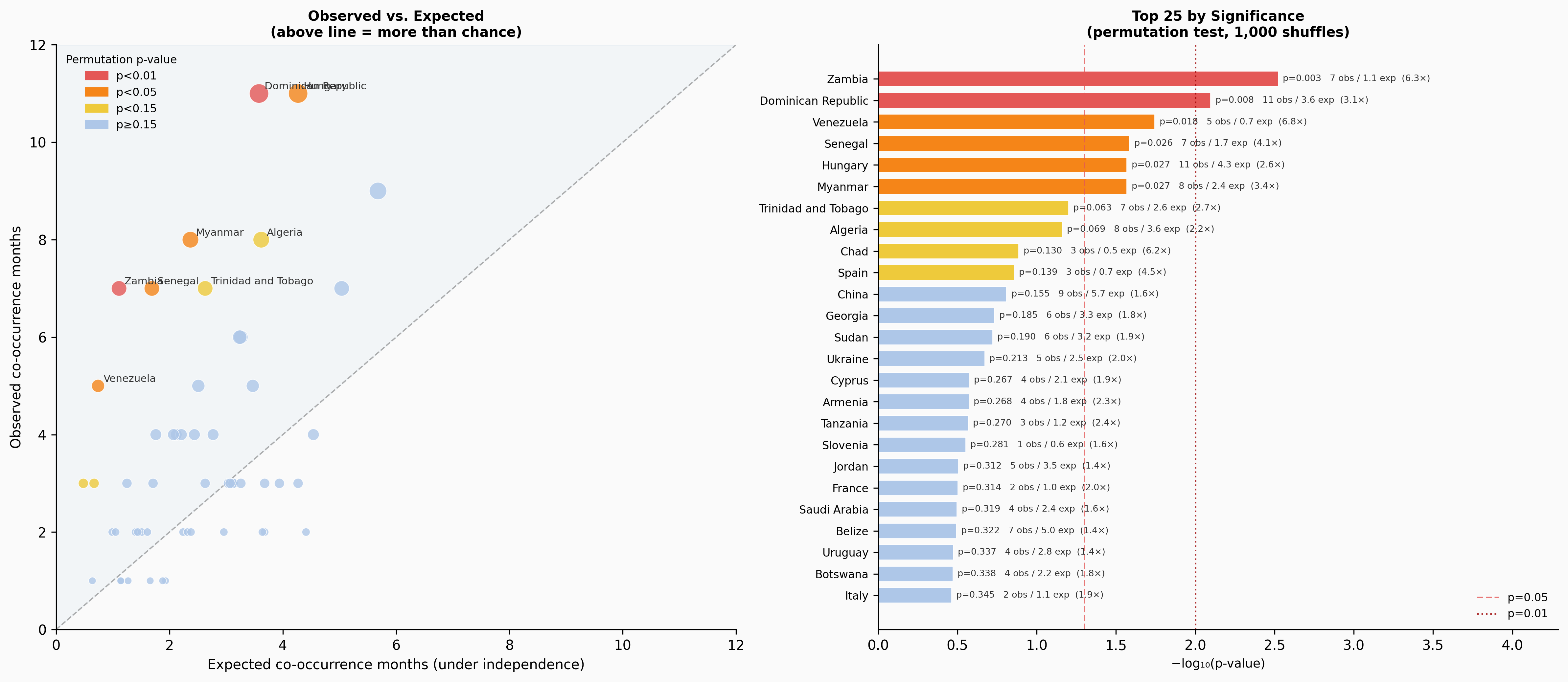
Summary: 148 countries tested · 6 significant by permutation test (p<0.05) · 3 by binomial test · 0 significant by both
Six countries reach p < 0.05 by the permutation test: Zambia, Dominican Republic, Venezuela, Senegal, Myanmar, and Hungary. Ukraine, which feels like the clearest intuitive case, reaches only p = 0.21 — it has 5 observed co-occurrence months against an expected 2.5, a 2× ratio, but with only ~90 months of overlap that’s not enough to reach conventional significance.
Overall: Is There a Global Signal?
The per-country tests tell us about individual cases. But we can also ask whether the overall pattern across all countries is significant — whether the distribution of p-values itself suggests a systematic relationship.
| Test | Statistic | p-value | Interpretation |
|---|---|---|---|
| Fisher’s Combined | χ²=144.5 (df=296) | 1.000 | p-values not enriched toward zero |
| Sign Test | 32/54 countries above expected | 0.110 | 59% above chance, not significant |
| Pooled Binomial | 26 obs vs 22.3 exp | 0.242 | Slightly above expected, not significant |
| Aggregate Windowed | 202 obs vs 254 exp | — | 0.80× — below chance overall |
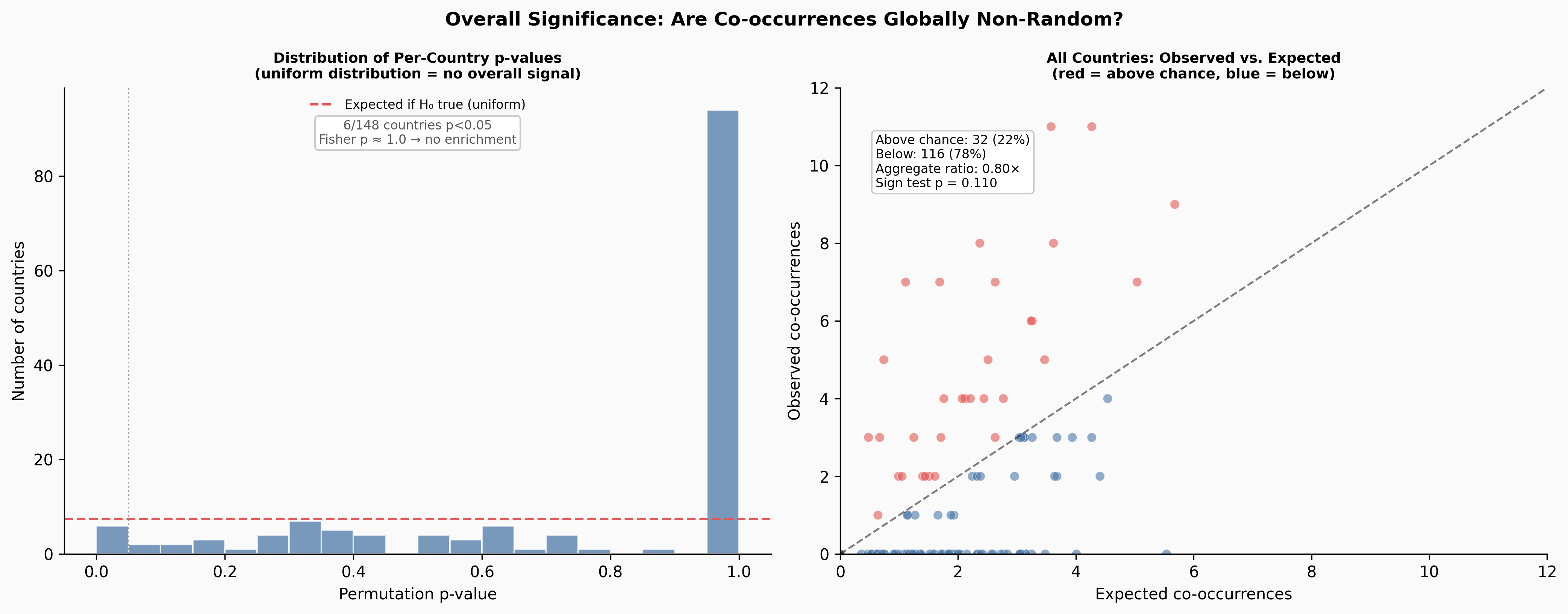
The overall answer is clear: across all 148 testable countries, trade and violence co-occurrences are not occurring at rates above what independence would predict. The aggregate windowed ratio is 0.80× — actually below expected. The p-value distribution is flat, not skewed toward zero as it would be if there were a systematic global signal. Fisher’s combined test gives p ≈ 1.0.
Discussion
What This Does and Doesn’t Mean
The absence of a global signal doesn’t mean trade and violence are unrelated. It means this particular combination of detection methods — rolling 12-month average deviation, 3-month co-occurrence windows — isn’t sensitive enough to pick up a global systematic relationship.
There are two plausible explanations for the 0.80× aggregate ratio (observed below expected):
First, the rolling average method may actually work against us here. If trade and violence move together slowly — which is the most plausible real-world mechanism — both series get smoothed by the rolling average before either gets flagged. A country experiencing sustained joint decline in trade and escalation in violence would generate small deviations in both, not large ones.
Second, the causal mechanisms are diverse and not time-locked to a 3-month window. Sanctions regimes can take months or years to fully transmit into trade data. Supply chain rerouting can precede visible trade disruption. Not all conflict affects trade equally — a country’s internal violence may have limited impact on its international trade if the conflict is geographically contained.
Where the Method Does Work — With a Caveat
Before celebrating the six countries that reach p < 0.05, note the multiple-comparisons problem: with 148 tests at a 5% threshold, we’d expect about 7 significant results by chance alone even if no relationship existed anywhere — and the flat p-value distribution above says that’s exactly the world we’re in. Six observed against seven expected is not evidence of a subset of “real” cases; it’s what a null looks like. Two of the six (Dominican Republic and Hungary) have no obvious conflict-trade narrative at all, which is what false positives tend to look like.
That said, for four of the six, the stories are at least coherent — worth flagging as hypotheses, not conclusions:
- Venezuela: the 2019 economic collapse, driven by the political crisis and US sanctions, shows clear co-occurrence of trade anomalies and violence spikes
- Myanmar: the 2021 coup and subsequent violence aligns with trade disruption
- Senegal: political unrest in 2021–2023 coincides with trade volatility
- Zambia: the 2021 election period and debt restructuring process overlap with anomalous trade months
Ukraine reaches p = 0.21, which might seem surprising. The reason is statistical: with ~90 months of overlap data and 5 co-occurrence months against an expected 2.5, you simply don’t have enough observations to be confident. The effect size (2×) is real — the test just can’t confirm it with this sample.
What to Try Next
The rolling-average deviation method is a reasonable starting point but has known gaps. The most promising next step is STL decomposition (Seasonal-Trend-Loess), which explicitly separates the seasonal component — trade has strong calendar patterns — from the trend and the irregular residual. Testing for anomalies in the residual alone, stripped of trend and seasonality, would give a much cleaner signal. The 2019 Venezuela collapse, which the rolling-average method caught but only barely, would likely be a stark outlier in the residual series.
CUSUM (cumulative sum control charting) would complement this for detecting sustained directional shifts rather than point anomalies. It’s designed precisely for the case where no individual month is extreme but a persistent run of below-normal observations indicates something has changed.
Closing: On Vibe Coding Analytical Work
The entire analysis in this post — from loading the data to the final significance tests — was done through conversational iteration with Claude Dispatch, entirely on my phone. I described what I wanted to explore, reviewed the charts as they came back, pushed back when something looked wrong (the date parsing bug that collapsed all months within a year to January 1st was caught visually, not by reading code), and refined the methods through conversation.
The only manual step was downloading the source data files before the session began.
This was an intentional experiment in vibe coding — directing analytical work through natural language rather than writing the code myself. A few things stood out:
The back-and-forth worked better than I expected for diagnosis. When Venezuela’s 2019 drop wasn’t flagged, explaining why in natural language (“the data looks the same every year”) prompted an immediate and correct root-cause analysis. The conversation naturally surfaces trade-offs that code comments rarely capture.
It worked less well for precision. The date parsing bug went unnoticed by the model until the charts looked wrong — it was only visually obvious. Statistical choices (thresholds, window sizes) benefit from more explicit discussion than natural language conveniently affords.
The overall experience was somewhere between pair programming and delegation. I set the direction, reviewed the outputs, and made judgment calls. The model handled implementation. Whether that’s a good division of labor depends entirely on whether you trust the charts you’re shown — which requires enough domain knowledge to know what the data should look like.
Data sources: IMF IMTS · ACLED · Analysis conducted April 2026