| Country | Partners | Months | Date range | Avg monthly exports (USD M) |
|---|---|---|---|---|
| Ukraine | 202 | 108 | Jan 2017 – Dec 2025 | 3,832 |
| Venezuela | 141 | 108 | Jan 2017 – Dec 2025 | 1,098 |
| Yemen | 76 | 108 | Jan 2017 – Dec 2025 | 9 |
| Mexico | 202 | 108 | Jan 2017 – Dec 2025 | 43,389 |
| Denmark | 205 | 108 | Jan 2017 – Dec 2025 | 10,078 |
Predicting Trade: Anomaly Detection via One-Step-Ahead Forecasting (Part 1)
Starting with the simplest possible baseline: a 12-month moving average
trade
forecasting
anomaly-detection
time-series
python
NoteA note on how this was made
This post is part of an ongoing series on IMF International Merchandise Trade Statistics (IMTS) data, built entirely through vibe coding in Claude Dispatch. I describe the analysis I want; Claude writes and runs the code; I review the results and push back. The analysis is what emerged from that back-and-forth.
The core idea
In the previous post, we looked at trade data as a potential signal for political disruption — comparing raw anomalies in trade volume against ACLED political violence events. The approach worked for some countries (Ukraine, Venezuela) and not for others, partly because “anomaly” was defined in a fairly naive way.
This post tries something a bit more principled: instead of just flagging unusual values, we predict what the next month’s trade should look like, and treat large prediction errors as anomalies. The intuition is clean — if your model is good, anything it fails to predict is genuinely surprising. If it’s bad, its failures are just noise.
To make that logic work, you need model quality and anomaly interpretability to be linked. The better the model, the more you can trust its residuals as signals. The worse the model, the harder it is to know whether a large residual is a real structural break or just the model being wrong in a boring way.
This post intentionally starts with the worst reasonable baseline: a 12-month moving average. It’s not a good model. It doesn’t handle trends. It doesn’t handle seasonality. It lags behind reality by construction. We’re establishing a floor here — a benchmark whose limitations will motivate something better in the next post.
The question we’ll explore: even with a bad model, what do the residuals look like for countries with known structural breaks?
Setup
Data
The IMF IMTS flat file contains 402,443 rows covering 227 reporting countries and 108 monthly periods (January 2017 through December 2025). Each row is a unique REPORTER.INDICATOR.PARTNER.FREQ combination; the indicator XG_FOB_USD is goods exports in USD millions, valued FOB.
For this analysis we’re working with five countries: Ukraine, Venezuela, Yemen, Mexico, and Denmark. They were chosen to span a range of stories — two countries with severe conflict-era disruptions (Ukraine, Yemen), one with a prolonged economic collapse (Venezuela), one large stable emerging-market exporter (Mexico), and one small stable high-income exporter as a control (Denmark).
After loading, we melt the wide-format monthly columns into a long format and compute each partner’s share of total exports. The world aggregate (partner code G001) is our denominator. We keep only bilateral partners with real ISO3 country codes — filtering out the IMF’s group codes like G998 (not allocated) and GX-prefixed regional aggregates.
One consequence of working in shares: they’re compositional. Partner shares within a country sum toward 100%, so a genuine shock to one partner mechanically moves every other partner’s share in the opposite direction. Anomaly flags across partners of the same country are therefore not independent — a cluster of same-month flags can be one event, not several.
Trade partner composition
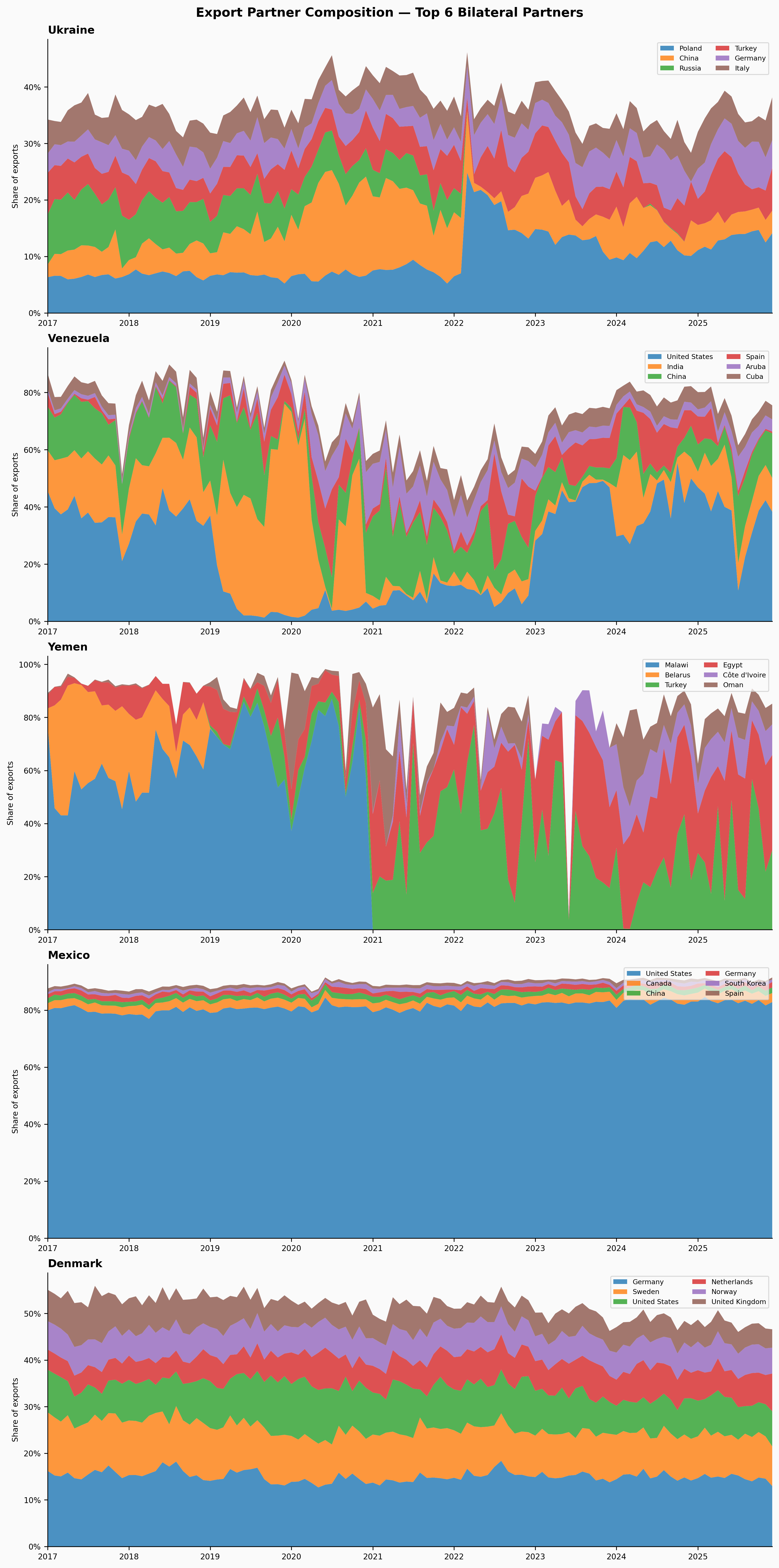
Before modeling anything, it’s worth visualising the underlying structure we’re trying to predict. For each country we find the top 6 bilateral trade partners by average export share, then plot their shares as a stacked area chart over time.
A few things to notice before we start predicting:
- Ukraine has a diverse mix that visibly reshuffles around 2022. Russia’s share collapses; Poland and China pick up.
- Venezuela is heavily concentrated in a few destinations, with the United States dominant early and declining sharply after 2019.
- Yemen has sparse, erratic data — small absolute volumes and a few opportunistic partners filling the gap after conflict disruption.
- Mexico shows extreme concentration in the United States, stable and predictable year after year.
- Denmark is well-diversified across European neighbors and the United States, with very smooth dynamics.
These patterns set expectations for the model. Mexico and Denmark should be easy to forecast — the patterns are stable. Ukraine, Venezuela, and Yemen will be harder.
The model: 12-month moving average
The model is as simple as it looks. For each country-partner time series of export shares, we compute a 12-month rolling mean and shift it forward by one period. That shifted value is our one-step-ahead prediction:
\[\hat{s}_t = \frac{1}{12} \sum_{k=1}^{12} s_{t-k}\]
The residual is just actual minus predicted: \(e_t = s_t - \hat{s}_t\).
We need a full 12 months of history before making any prediction — no partial windows — so the first valid residual is at month 13 of each series.
Why is this a bad model? A few reasons:
It can’t follow trends. If a partner’s share is steadily increasing (say, China’s share of Ukraine’s exports over 2022–2024), the MA will persistently underpredict — producing systematically positive residuals that have nothing to do with anomalies.
It doesn’t know about seasonality. Trade patterns often have seasonal cycles. The MA smooths them out and then flags months where seasonality deviates from the average — which is most months.
It reacts slowly. After a genuine structural break, the MA takes 12 months to fully incorporate the new level. During that period, it flags every month as anomalous.
These are features for our purposes, not bugs — they’ll help us understand exactly what a better model needs to do.
How bad is it?
The table below shows mean absolute error (MAE) and root mean squared error (RMSE), both in percentage-point terms, averaged across the top 6 partners for each country. The numbers confirm what we expected from the charts.
| Country | Avg MAE (pp) | Avg RMSE (pp) |
|---|---|---|
| Ukraine | 1.38 | 1.99 |
| Venezuela | 5.33 | 7.68 |
| Yemen | 8.35 | 10.91 |
| Mexico | 0.34 | 0.43 |
| Denmark | 0.71 | 0.93 |
Mexico and Denmark are nearly predictable by this simple model — partner shares are so stable that even a naive 12-month average tracks them well. Yemen is the worst, with RMSE above 10pp. That’s partly genuine disruption, but it’s also partly that Yemen’s trade data is sparse and erratic at baseline, so the model has nothing stable to learn from.
Anomaly detection
With residuals in hand, we flag months where the absolute residual exceeds 2 standard deviations of the residual distribution for that series. The threshold is computed per series — so a 5pp residual in Yemen (high-noise baseline) means something very different from a 5pp residual in Denmark (low-noise baseline).
Formally: for each country-partner series, we compute \(\sigma\) = sample standard deviation of \(\{e_t\}\), then flag month \(t\) if \(|e_t| > 2\sigma\).
Two caveats worth stating up front. First, the base rate: a two-sided 2σ rule flags roughly 4.6% of months by construction if residuals are approximately normal — so a series with 96 usable months will produce four or five flags even if nothing interesting ever happened. Any claim that the flags mean something has to clear that bar. Second, σ is estimated from all residuals including the anomalous ones. In heavily disrupted countries the outliers inflate σ, which then masks smaller genuine events — a classic masking problem. A robust scale estimate (like MAD) would mitigate this; we’ll return to it in Part 2.
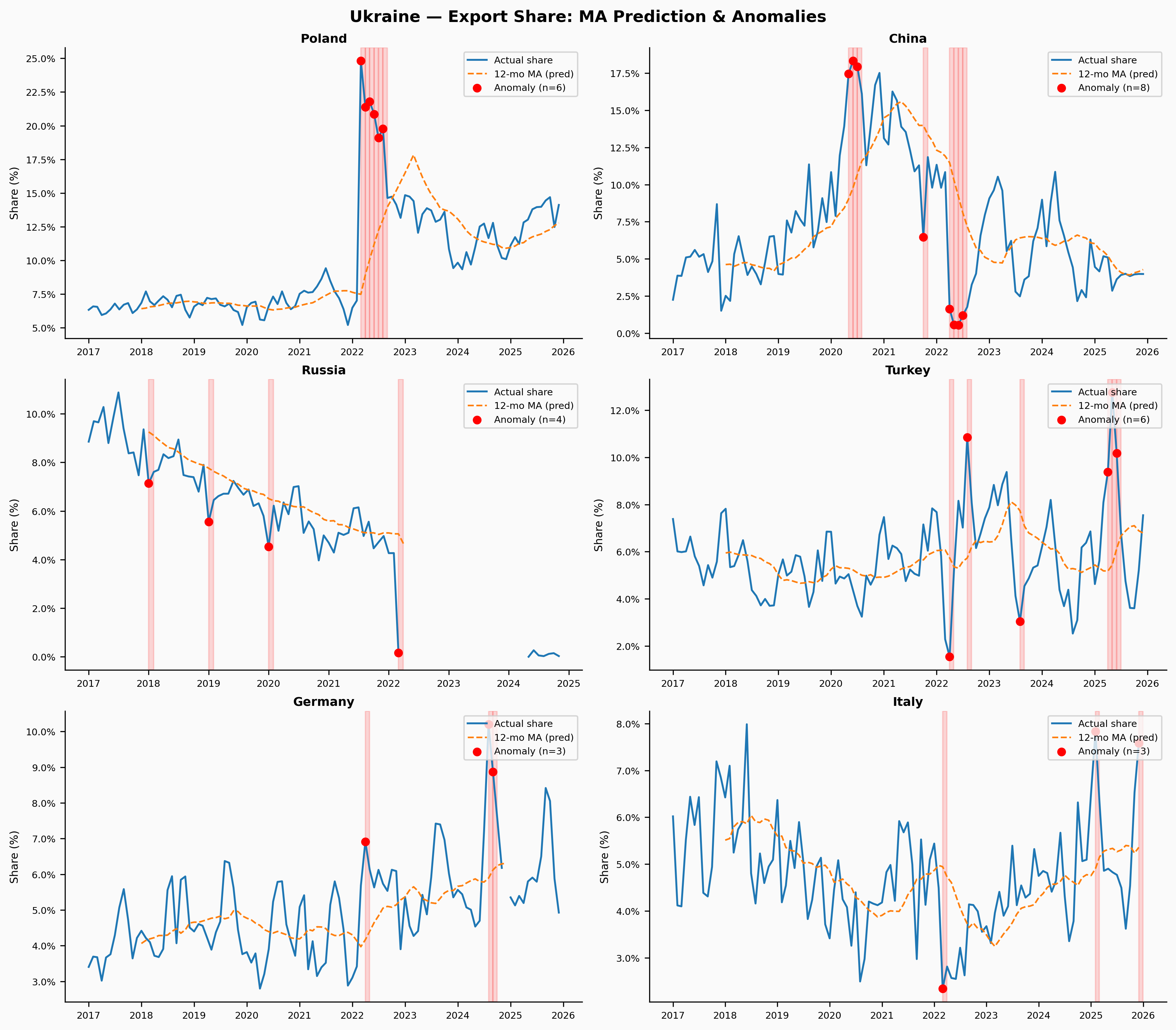
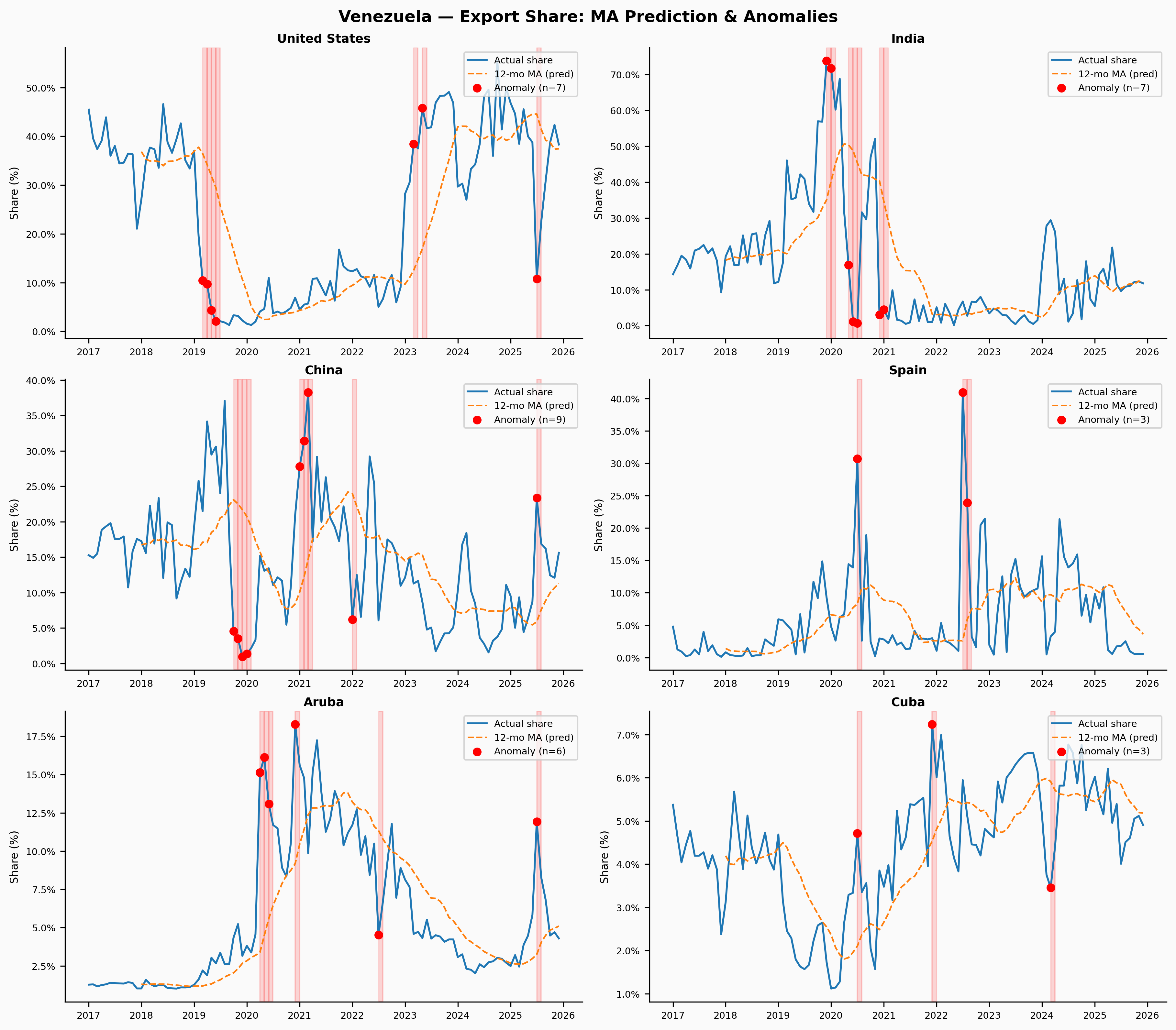
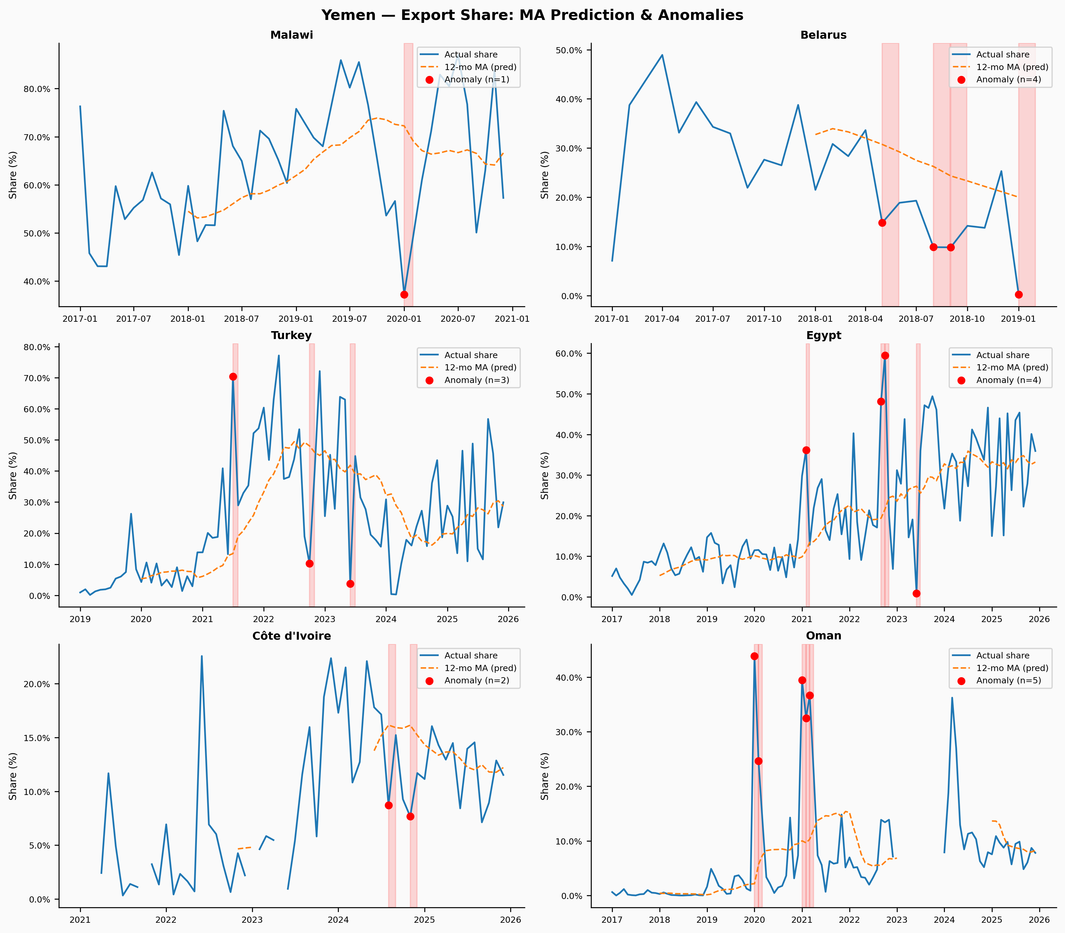
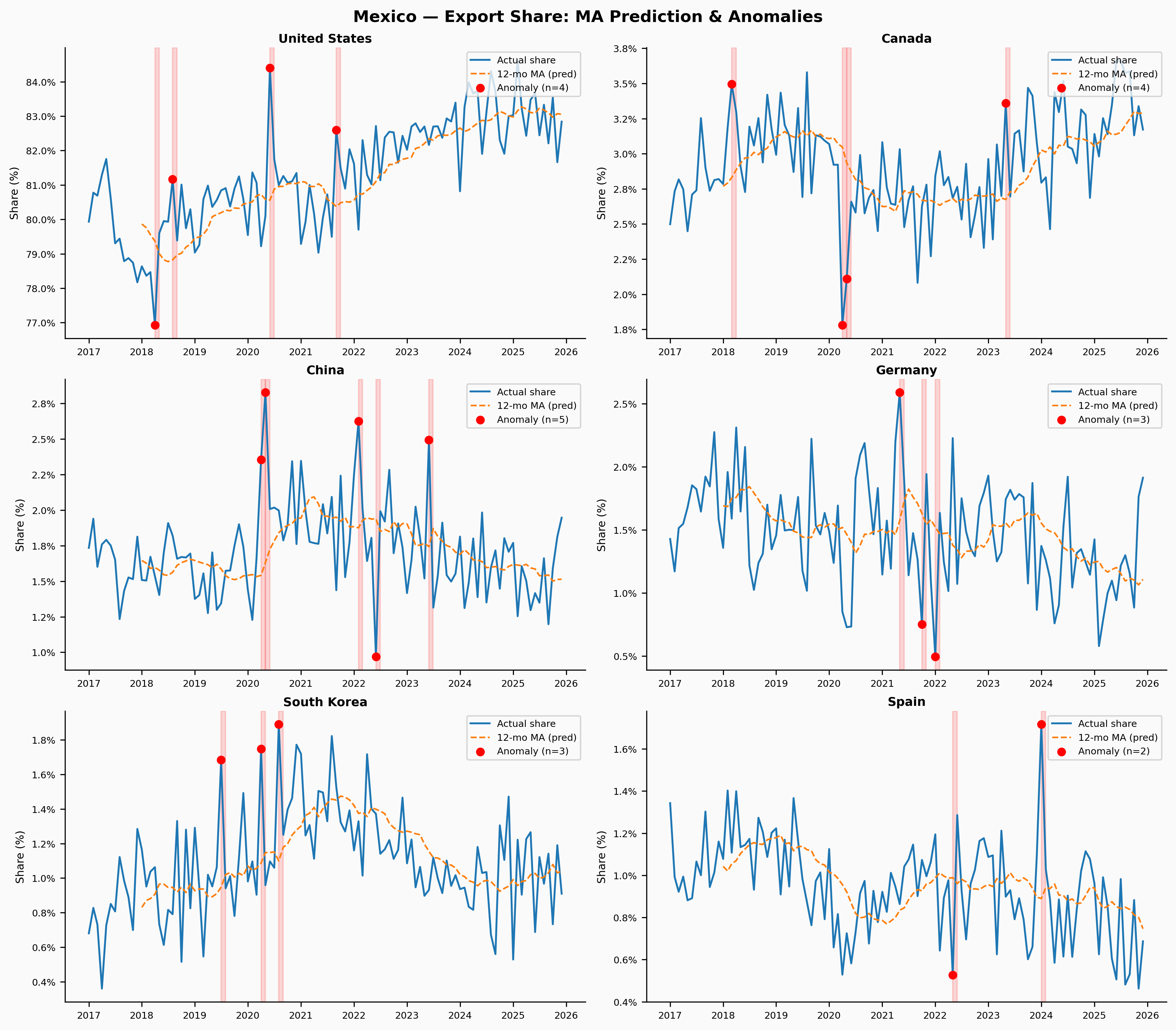
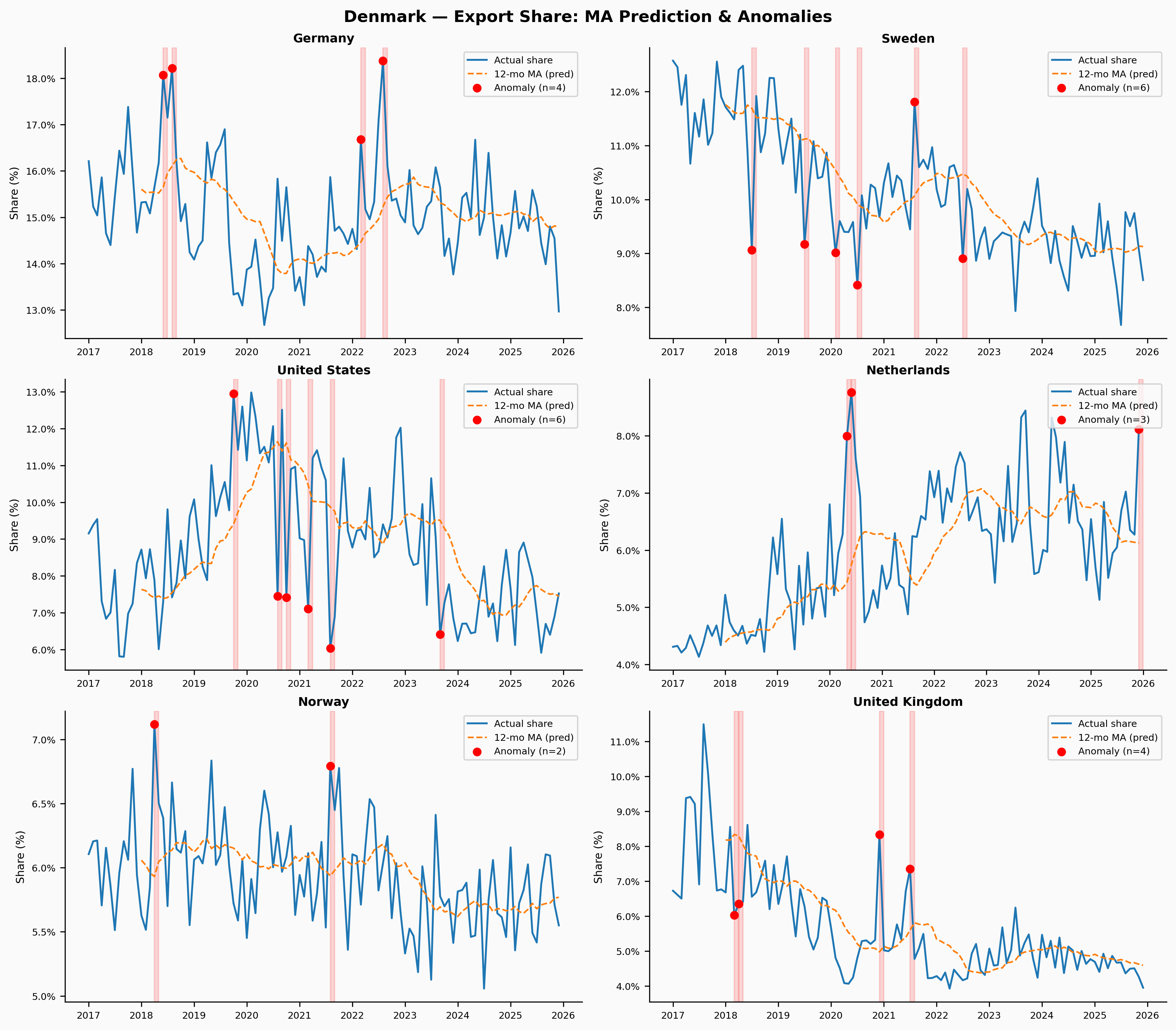
The charts below show, for each country and each of its top 6 trade partners: the actual export share (blue), the MA prediction (orange dashed), and anomalous months highlighted in red. Red vertical shading marks the flagged months; red dots mark the actual value at those points.
Ukraine
Ukraine is the clearest case. The Russian invasion in February 2022 restructured trade relationships almost overnight — Russia’s share of Ukrainian exports collapses, Poland’s surges, and Turkey and China grow as alternative corridors. The MA model is completely unprepared for any of this and flags a sustained run of anomalies across multiple partners starting in early 2022.
Venezuela
Venezuela’s story plays out differently — the disruption is slower, more economic than military. The hyperinflation crisis from 2017–2019 and the deepening US sanctions reshaped trade relationships gradually. The model flags extended anomaly periods for the US and India relationships, and the Spain series shows sustained misprediction as those flows collapsed.
Yemen
Yemen is the hardest case — sparse data, small volumes, and a civil war that has made reliable reporting nearly impossible. The flagged anomalies are numerous but hard to interpret: they’re as likely to be data quality issues or one-off humanitarian shipments as genuine structural signals. This is a useful reminder that anomaly detection is only as good as the underlying data.
Mexico
Mexico shows what a clean, predictable series looks like. The US relationship is so dominant and so stable that even the moving average tracks it almost perfectly. The few flagged months tend to cluster around 2020 (COVID-era disruptions) and the 2022–2023 near-shoring surge. This is actually the most useful output from the model — because the baseline fit is good, the flagged anomalies carry real information.
Denmark
Denmark is our control — a small, stable, high-income exporter with diversified trading relationships that change slowly. The MA model does well here by construction. The few flagged anomalies are worth examining in future work, but they’re likely to be either seasonal artefacts or one-off reporting quirks rather than structural breaks.
What the moving average gets wrong
A 12-month moving average is a bad forecasting model in three specific ways, each of which shows up in the residuals:
It can’t follow trends. Wherever a partner’s share is steadily changing — China’s growing share of Ukraine’s exports post-2022, the US share of Venezuelan exports declining year after year — the MA will consistently lag. Those systematic errors accumulate into residuals that are correlated over time, not independent. A proper model would need to explicitly model trend as a separate component.
It treats seasonality as signal. If a country’s exports to one partner spike every December (say, for commodity shipments ahead of winter), the 12-month MA smooths that pattern away and then flags December every year as anomalous. The anomaly detector is picking up the calendar, not the economy. A better approach would separate out seasonal patterns before looking at residuals — which is exactly what STL decomposition does.
It flags structural breaks persistently. After a genuine shock — like the 2022 invasion — the MA spends 12 months slowly incorporating the new level while flagging every intervening month as anomalous. This is the correct behavior in one sense (something really did change), but it’s not very useful analytically. You’d want to know when the break happened and what the new normal looks like, not just that things were weird for a year.
The high RMSE for Yemen and Venezuela isn’t primarily the model’s fault — those series are inherently noisy. But for Ukraine and Mexico, the model’s failures are clearly structural.
What’s next
Part 2 will replace the moving average with something that can handle these three problems: seasonal-trend decomposition (specifically, STL). The idea is to separate each series into a trend component, a seasonal component, and a residual before doing any anomaly detection. By only looking at the residual component, we remove the model’s susceptibility to calendar effects and smooth trends.
The hypothesis is that the anomalies flagged by a good model will be both fewer and more interpretable — concentrated in genuine structural breaks rather than distributed across every seasonal peak. Ukraine’s 2022 anomalies should still show up; Denmark’s shouldn’t.
We’ll also add a proper evaluation framework: for countries with known event dates (the Ukraine invasion in February 2022, Venezuela sanctions in 2019), we can measure whether the anomaly detector actually identifies the right months.
Data: IMF International Merchandise Trade Statistics, bulk flat file download. Part 1 needs only pandas, numpy, and matplotlib; Part 2 brings in statsmodels.